
The Uffizi Galleries was awarded the Compasso d’Oro Prize, the oldest and most important design award in the world, for the effectiveness of their logo.
These are the reasons for the assignment:
“It is synthesis of values and identity condensed into a symbolic monogram. Simplicity and uniqueness ensure recognizability and discourage imitation.”
It was director Eike Schmidt in 2017 who wanted to endow the famous museum complex, for the first time in its history, with a logo to represent its image:
“It was necessary for the Uffizi Galleries to have a logo that is easily recognizable to visitors from all over the world, even from cultures that do not use our Latin alphabet. We are grateful to Elio Carmi and Alessandro Ubertis for having for the first time created a graphic identity for the Uffizi that manages to make the noble and simple proportions of Vasari’s architecture totally contemporary.
The word from Gianluca Magri
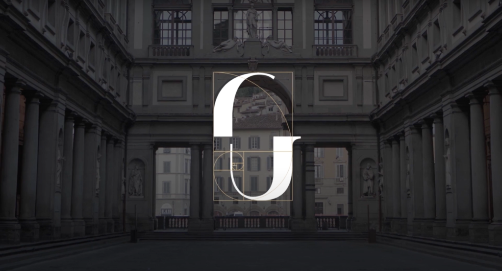
The identity of the Uffizi Galleries synthesizes in an open sign the confluence of three main references:
- theVasarian arch, an explicit homage to the Florentine Renaissance, a significant trait d’union between nature and art, history and tomorrow.
- the divine proportione or golden section, with mathematical properties found in many natural and cultural contexts, a symbol of balance and perfection.
- the monogram, synthesis to form graphic signs of belonging. In art first it was Albrecht Dürer who multiplied it, spreading culture.
So I thought I would question Gianluca Magri, Art Director and consultant, who was already a guest speaker last July at the Italian Museum Summit, to hear his opinion on the matter.

“Surprising news, but if we take a closer look at what actually happened, it becomes exciting.
First, the award: The Compasso d’Oro is the oldest and most prestigious award for Italian design, given by the Association for Industrial Design, usually to brands of automobiles, buildings, products and, in general, “tangible” objects.
I could tell you it’s like the Telegatto of design awards!
This irony of mine actually hides a far more pronounced envy/admiration and a certain excitement and curiosity. We are still talking about a huge recognition, created and sustained by legendary deities of industrial and non-industrial design.
What logo or branding can be so crazy as to receive a Compasso d’Oro?”
Nothing is left to chance
“Titanic work has been done, just one excerpt featured in the brand book can give us an idea of how much work went into it and how NOTHING was left to chance. Nothing, absolutely nothing went unnoticed. From the editorial to the spaces, digital and printed communication, the general language and the rules to be observed.
Everything was defined, designed and set around the brand, an incredibly simple monogram.
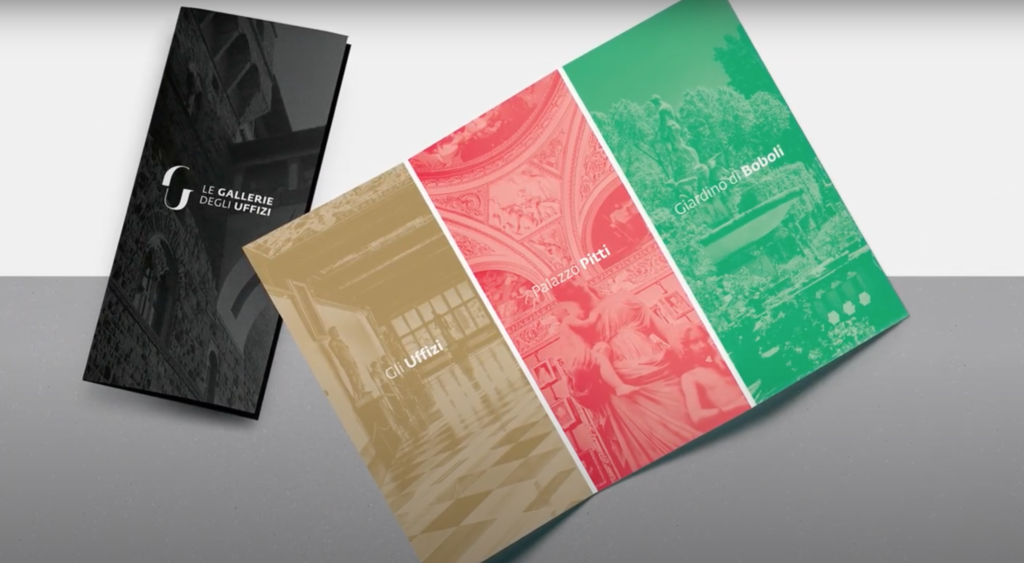
Now, however, I will tell you the point that intrigues me the most: turning a museum (rather, THE museum…let’s talk about the Uffizi/Palazzo Pitti/Boboli Gardens) into a “product.”
To describe, on a figurative level, the image and identity of a public entity enough to merit an award of this magnitude. I find it beautiful!
It gives me confirmation on the reasoning I brought to the Italian Museum Summit:
creating a brand is not just about making a pretty “logo,” it’s not enough to show that you can exploit golden proportions or that you’re an Illustrator wizard. The Uffizi logo is simple, pure and straightforward.
There will certainly be no shortage of objectors with an ever-present (and very stupid) “what’s the big deal, I knew how to do that stuff there, too,” but the issue goes far beyond the beautiful graphic sign and the perfection of proportions.
Here we talk about language, attention to detail, endless declinations, but above all, work that 100% represents the client’s needs and style.
A new comprehensive visual identity, able to tell the story of the Uffizi Galleries in its entirety, respecting the personality of the individual entities. A complete and modular communication that defends the client’s recognizability.
To sum up: they deserved the award not so much for the painting (the monogram), but for the incredible frame, frame, and wall that house the work.
I conclude by saying let it be a case history for all of us. The brand needs to tell a story and not just look good.”
If you would like to share your opinion or learn more about it we are talking about it here: